Color is the fastest way to look well-rested, intentional, and styled. The problem? Most advice is either too generic or too scientific. As a stylist, I use a simple trio to build wearable palettes: undertone, value, and contrast. When those three align with your features and lifestyle, your closet starts playing in harmony. Let’s translate theory into decisions you can make in a fitting room with one mirror and terrible lighting.
First, undertone. This is about temperature—not lightness or darkness. Stand by a window with a pure white tee under your chin. If your skin reads golden, peach, or olive next to the white, you’re likely warm. If it reads rosy or bluish, you’re cool. If it’s hard to say, you’re probably neutral. Warm wardrobes glow in earthy and sun-touched tones like camel, olive, rust, and coral. Cool wardrobes shine in inky, jewel, and sea tones like charcoal, navy, emerald, and fuchsia. Neutral doesn’t mean “anything goes,” it means you can choose a direction and stay consistent.
Second, value—the lightness or darkness of a color. Try this: squint at your face in a mirror. Do you read overall light, medium, or deep? People with lighter value often look freshest in lighter outfits with one medium anchor; deeper value comes alive with saturated or darker looks with one light highlight. Mid-value faces enjoy the broadest spectrum but should still steer their outfits toward the middle lane to avoid extreme contrasts washing them out.
Third, contrast—the difference between your hair, skin, and eyes. High-contrast faces (dark hair, light skin; piercing eyes) can carry bold, high-contrast outfits: navy and white, black and cream, burgundy with blush. Low-contrast faces look best when the outfit transitions gradually—think camel on cream, denim with soft gray, olive with sand. Matching outfit contrast to facial contrast is a quiet magic trick. It makes people say, “You look great,” not “That’s a great sweater.”
With the trio in mind, build a five-color capsule palette that can flex year-round: two neutrals, two mains, one accent. Example warm set: camel and cream (neutrals), olive and rust (mains), coral (accent). Example cool set: charcoal and navy (neutrals), teal and burgundy (mains), fuchsia (accent). Keep metals aligned (gold for warm, silver for cool, mixed or brushed for neutral) and watch how your accessories suddenly “match” everything.
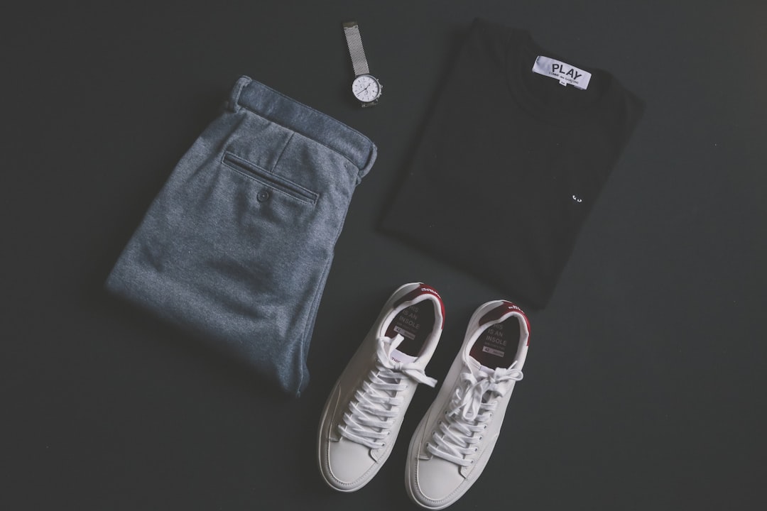
Don’t sleep on texture. A single-color outfit can look richer than a rainbow when textures vary: matte wool pants with a satin blouse under a grainy leather jacket. Texture is color’s quiet cousin—use it to add depth when your palette is minimal. If you love black and navy, texture is how you make them feel intentional rather than default.
Use the rule of three. If a color shows up once, it risks feeling random. If it appears twice or three times, it becomes a theme. Repeat navy in a blazer, belt, and the stripe of your sneaker. Mirror a pop lip with a floral motif or a pendant. When in doubt, repeat your accent near your face—scarves, earrings, ties, or frames are your best allies.
Prints deserve a quick strategy. If you’re high-contrast, look for prints with clear light-dark distinction; if you’re low-contrast, choose prints where the colors sit closer in value. Keep scale relative to your features: finer prints for delicate features, bolder for stronger features. And make sure your print contains one of your neutrals; that’s how it integrates with the rest of your closet.
Lighting can sabotage even the best color choice. Department-store LEDs often skew cool and flatten color. Always step near a window, or at least take a quick phone photo and look at it with your screen brightness at mid-level. If a shade only flatters in one lighting scenario, it’s not worth the closet space.
Quick-fitting-room checklist: - Temperature check: does the color warm up or cool you down in a good way? - Value check: is the garment’s value fighting your overall value? - Contrast check: does the outfit’s contrast mirror your facial contrast? - Repeat rule: can you repeat the color elsewhere in your look? - Mix test: will it pair with three things you already own?
Finally, give yourself an accent allowance. Let 80% of your wardrobe live inside your defined palette and reserve 20% for play. Try pistachio for spring, electric blue for summer, cinnamon for fall, or deep plum for winter. The rule: new accents must work with at least three items you already own. If a newcomer is a lone wolf, it will demand companions you’ll resent buying later.
Color theory doesn’t need a textbook. It needs awareness and repetition. When you align undertone, value, and contrast—and keep your palette tight enough to repeat on purpose—you stop wondering what goes with what. Your closet answers for you. That’s the moment color starts loving you back.